Styling the map
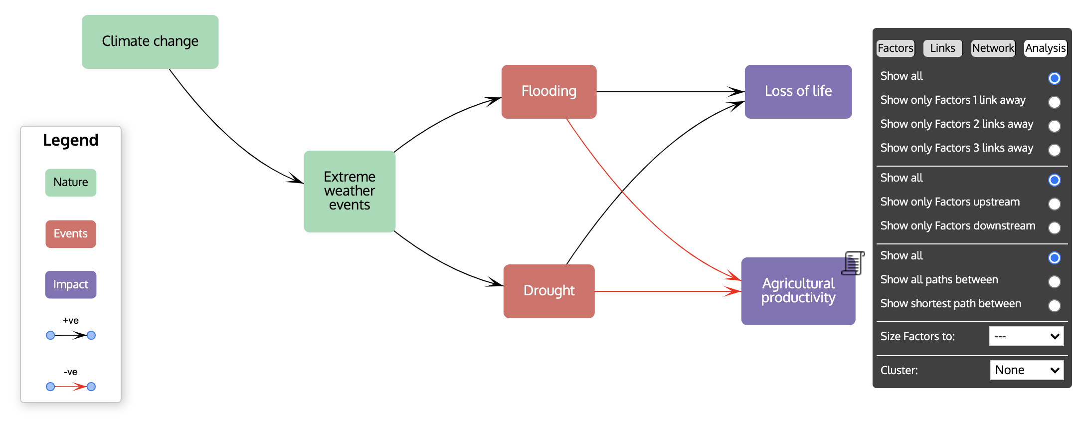
The view you see when you first open the app is intentionally very simple, but hidden away are many more features. To access these, click on the last, Settings, button on the top bar: ![]() . This will reveal a set of four tabs: Factors, Links, Network and Analysis, with the Factors tab open.
. This will reveal a set of four tabs: Factors, Links, Network and Analysis, with the Factors tab open.
The panel showing the tabs can moved across the network pane: drag it using the thin black strip at the top of the panel above the tab buttons. This can be useful if the panel gets in the way of seeing the network.
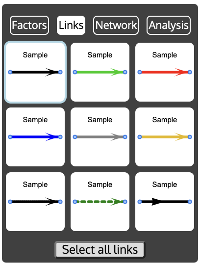
Factors tab
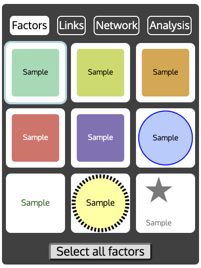
There are 9 sample styles for how factors can look. If you select a factor from the network and then click on one of the 9 styles, the factor will change to resemble the style. As a short cut, if you click on the 'Select all factors' button at the bottom, and then click on a style, all the factors will change to the chosen style.
Double clicking on any of the 9 styles opens a dialog box to change the style:
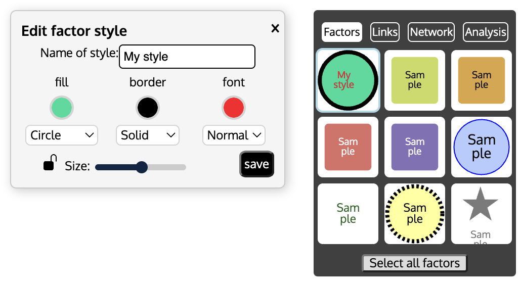
There are options to change the colour of the background (the 'fill'), the border and the font, to change the shape, for example to a rectangle or a circle, to change the border from solid to dashed or dotted or none, and to change the font size of the label. Clicking on the padlock symbol will lock all the factors with this style; clicking on it again will unlock them all. The Size slider adjusts the relative size of the factors. Moving the dot on the slider to the far left sets the factors to their normal size, and moving it to the right makes the factors bigger.
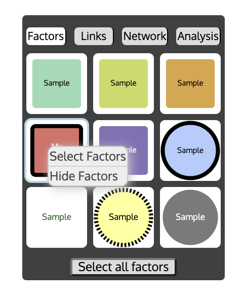
If you right click (or CTRL click) on one of the style samples, there is a menu with which you can either select all the factors that have that style, or hide all those factors from view.
Legend
You can also change the name of the style. If you do so, this name will appear on the network pane as one item in the 'legend'. So, for example, if you had some factors that are Activities, some that are Change mechanisms, some Outcomes and some Impacts, you could give four of the styles these names, colour their fills red, orange, yellow and blue, and then apply these styles to the appropriate factors in the network. The legend will be automatically displayed on the network pane:
The legend can be moved by dragging the top of the Legend pane.
Links tab
The Links tab is very similar to the Factors tab, except that it relates to the links. There are 9 link styles and each of these can be changed by double clicking the link style. There are options to change the colour of the link, whether it has an arrow at the end, whether it is solid, dashed or dotted, and to add a link label.
Network tab
The Network tab enables you to change many aspects of the network visualisation and what is shown in the window.
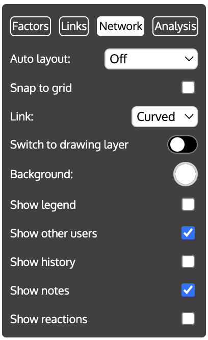
On the Network tab, there are controls for:
- Auto Layout Choose which layout algorithm (see below) to apply. The algorithm will then adjust the positions of the factors and links and, once complete, the selection will revert to 'Off', leaving the factors where the algorithm has placed them.
- Snap to grid When ON, factors shift to be at the intersection of invisible grid lines. This makes it much easier to line up factors neatly.
- Link Links can either be drawn using a curved line or a straight line. This control swaps between the two.
- Switch to drawing layer Puts the network pane into drawing mode, so that background shapes, images and text can be added. See Drawing Mode for more details.
- Background This changes the colour of the background of the network pane. Click on the colour well to display possible colours. The default is white, but a black background can also be effective.
- Show legend If the factor and link styles are given names (other than 'Sample'), the styles and their names will be shown in a panel at the left bottom of the network pane headed 'Legend', when this switch is ON. See the description of the Factors tab.
- Show other users When ON, the positions of other users' mouse pointers are shown in real time.
- Show history When ON, a panel displaying every change to a factor or link (adding a factor or link, editing it or deleting it) is shown. It is possible to 'rollback' the map to the state it was in before a change. This can be quicker than repeatedly undoing changes with the Undo button. To rollback, click on the button. You will be asked to confirm the action. The states of the map for the previous 10 changes are kept. Clicking on the clipboard icon
 copies the log to the clipboard, from where it can be pasted into a spreadsheet or word processor app.
 - Show notes When a factor or link is selected, normally a Notes panel pops up at the bottom right of the map. Turning this switch OFF prevents the Notes panels from being displayed.
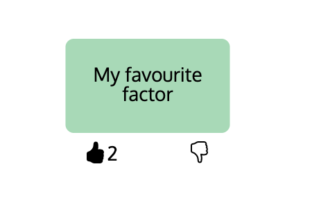
- Show reactions When this switch is on, a thumbs up (👍) and a thumbs down (👎) symbol appear below each factor. People can vote using these symbols (for example, to indicate which factors they think most important, or to 'Like' a factor), by clicking on the symbol. A second click removes their vote. The numbers beside the symbols indicates how many people have voted.
Layout
It is sometimes useful to get PSRM to arrange factors using an automatic procedure and then adjust their positions manually to achieve the desired placement. PRSM provides several layout algorithms:
- The trophic algorithm helps to reveal the causal structure of the map. With the trophic layout, the factors are arranged along the horizontal axis according to their positions (their trophic levels) in the overall causal flow within the system, making it easier to identify upstream and downstream factors; the linked chains of influence that connect them; and where factors act on the system within this overall causal structure (which may be upstream or downstream). It will re-arrange the factors and links to create a layout such that all the links point from left to right and are arranged according to trophic level.
- Fan Arranges the factors in a fan shape starting from a selected factor. You need to select at least one factor before using this layout option. It is most useful after displaying the factors up or downstream from a selected factor (see Analysis below for an explanation of Up and Down stream).
- Barnes Hut This is a 'gravity' algorithm. Each factor is modelled as though it has a mass that repulses all other factors with a force depending on the inverse square distance away, while the links are modelled as springs that pull the factors together. The algorithm is iterative, i.e. it tries repeatedly to find the best arrangement of factors that balance the repulsive forces between the factors and the attractive forces from the springs.
- Force Atlas 2 This is a variation of the Barnes Hut algorithm in which the repulsion between the factors is linear rather than quadratic.
- Repulsion Another variation of Barnes Hut.
There is no best layout algorithm that works for all networks; you need to see which one looks good for your map. If you don't like the effect of an algorithm, you can choose another one, or use the Undo button on the top bar to revert the map to its original layout.
Analysis tab
The Analysis tab allows you to view portions of the map and to cluster factors to help with the analysis of the network (see the Analysis section for help on how this can be useful).
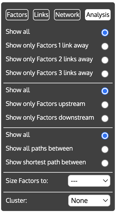
The panel is divided into five sections:
- Show only neighbouring Factors If you first select a factor (or several factors) and then one of these options, all factors in the network will be hidden, except for those 1, 2, or 3 links away from the selected factor(s). This is useful when you want to focus on just one part of a large network.
- Show only up or downstream Factors If you first select a factor (or several factors) and then one of these options, all factors in the network will be hidden, except for those 'downstream' (i.e. linked to the selected factor(s) by following links directed away from those factor(s)), or those 'upstream' (i.e. linked to the selected factor(s) by following links directed towards those factor(s)).
- Show paths between If you first select at least two factors, and then
- Show all paths between, only those links that lie on a path between the selected factors will be shown. A 'path' is a set of links that, following the direction of the arrows, connects two factors. There may be several ways of getting from one factor to another; if so, all the paths are shown. All factors that do not lie on the connecting paths are hidden.
- Show shortest path between displays only the path with the fewest links between the selected factors (if there are two shortest paths with same number of links, only one, chosen arbitrarily, is shown).
Here is an example. The first is the original network.
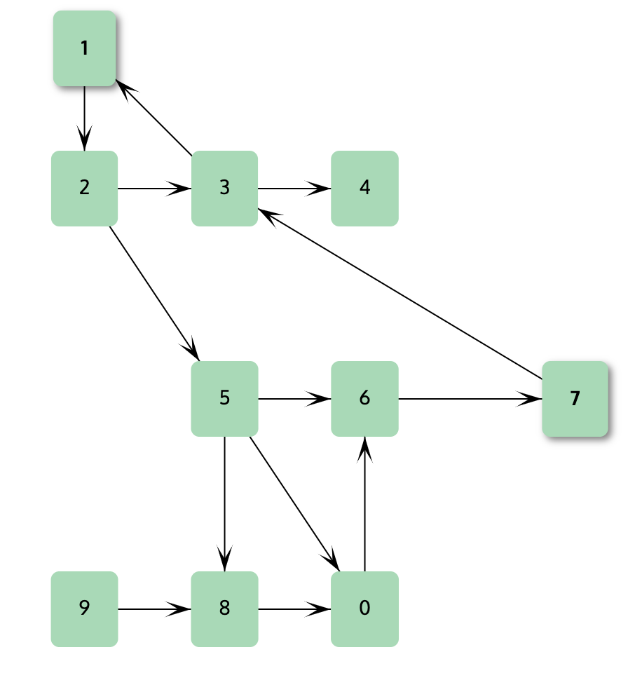
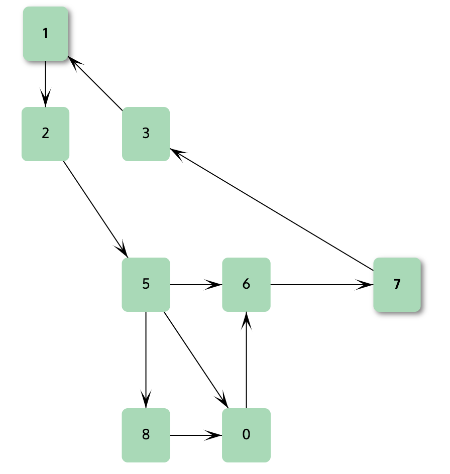
The second is the same network with Show all paths between Factors 1 and 7.
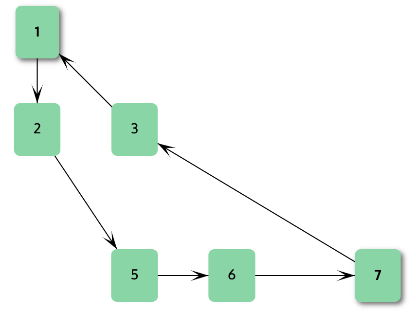
The third is the same network with Show shortest path between Factors 1 and 7.
The above three options can be combined. For example, the shortest path between two Factors option may display two paths: one with a couple of links and another feedback path going in the reverse direction that winds around the map and includes many links. Because it consists of many links, the latter path may not be of much interest. Choosing both Show Shortest path and Show only Factors 2 links away will display just the direct path.
-
Size Factors to This is used to change the size of the factors to be proportional to one of a set of metrics: the number of inputs (the 'in-degree'), the number of outputs (the 'out-degree'), the leverage (ratio of outputs to inputs), or the betweenness centrality. Note that the factors are always drawn large enough to accommodate their labels, and so the size may not be exactly proportional to the metric. The values of leverage and betweenness centality of a factor are shown in its Notes panel.
-
Cluster With large maps, it is sometimes useful to aggregate factors into groups, thus displaying the map at a higher level of abstraction. For example, all the factors relating to the effect of climate change might be replaced on the map by one 'Climate Change Cluster' factor, and similarly, all the factors concerned with transport replaced by one Transport factor. Links that used to go to factors outside the cluster are replaced by links that go to the new Cluster factor (and likewise for links that go from the clustered factors to factors outside the cluster).
For example, here is a simple map before clustering:
and here is the same map after clustering by Style:
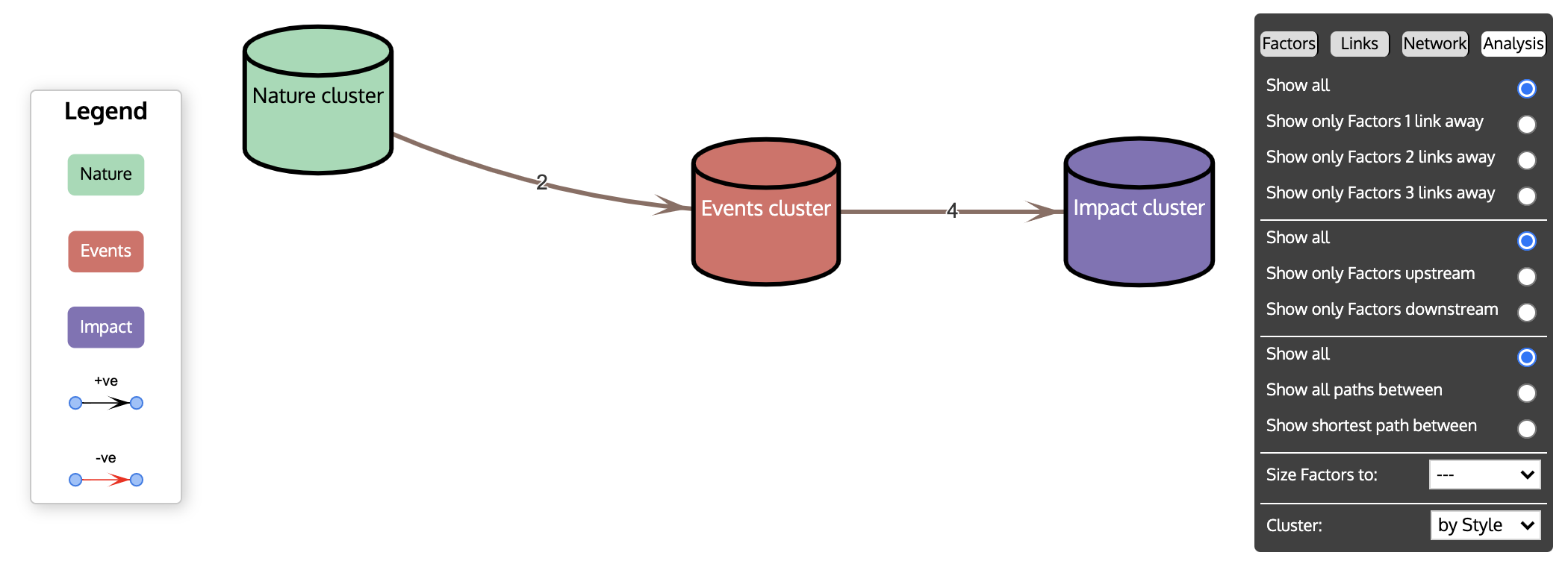
Links to and from cluster factors are labelled with the number of links that they aggregate.
Clustering is done according to the values of the clustering attribute - all factors with the same value for this attribute are joined into the same cluster. The Cluster pulldown menu offers as standard, Style (i.e. the factors' style as set in the Factors tab and Colour (i.e. the colour of the factors' backgrounds) as possible attributes with which to cluster. In addition, bespoke attributes can be used by creating a new column in the Data View and giving each factor a value there (see the section on the Data View for how to create attributes). These additional attributes are automatically added to the Cluster pull-down menu when they are created.
Once the map has been clustered, a cluster factor can be 'unclustered' (its component factors revealed) by right (CTRL) clicking it, and reclustered by right (CTRL) clicking any of the component factors. To uncluster the map as a whole, select None from the Cluster pull-down menu.