Data View
As well as the Map View, PRSM also provides an alternative Data View. This shows the factors and links in tables like a spreadsheet. You can make changes in the Data View and the changes to factors and links will immediately be passed over to the Map view. For some tasks, the Data View is more convenient than the Map, especially when one wants to summarise or make changes to lots of factors or links at the same time.
To see a Data View, open a PRSM map, click on the Share button at the top, and click on the Data View button. This will open a new tab in your browser showing the Data View.
The Data View table
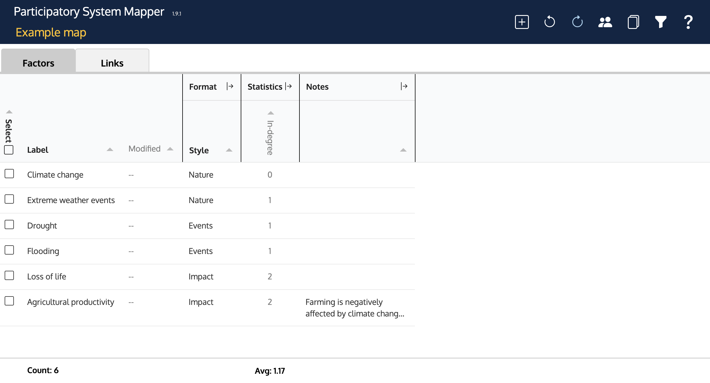
The main part of the Data View when opened shows a table with one row for each of the factors in the map. On the left are the factors' labels. To the right, there is a group of columns that show the format of the factors, a group of columns with various statistics about the factors and column showing the Notes attached to the factors. At the bottom of the table are summaries (counts of how many factors there are, the average betweenness centrality, and so on). If there are too many factors to fit in the window, you can scroll the table to the top or bottom.
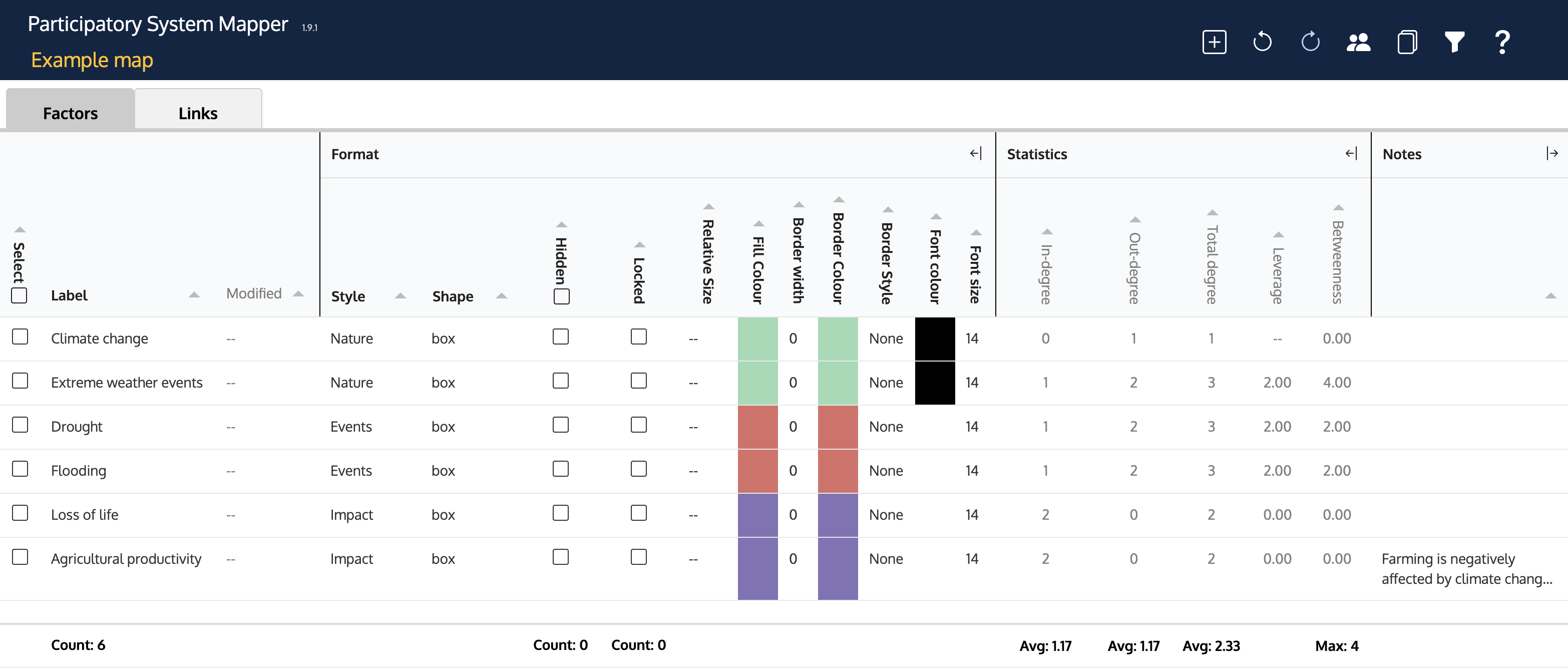
Only the first column of the Format and Statistics column groups are shown when the Data View is first opened. To reveal the other columns in each group, click on the ![]() to the right of the group heading. Similarly, the Notes column can be expanded to show more of the Notes.
to the right of the group heading. Similarly, the Notes column can be expanded to show more of the Notes.
Use the small triangles in the column headings to sort the table according to the values in that column - one click for ascending and two for descending.
Most of the cells in the Format section of these tables are editable (columns with headings in bold have editable cells; those with headings in grey are not). To edit a cell, click it. Depending on the column, you can then edit the text (e.g. the Label), select from a drop down menu (e.g. Shape) or enter a number (e.g. Font size).
Some columns need further explanation:
- Select If you edit a value in a row that has a check mark (tick) in the Select column, the same edit will be made in all the other rows that are checked. For example, if you check three rows and change the value of the Shape column in any one of the three selected rows to 'ellipse', the other two rows' shape will also change to 'ellipse'. This is a convenient way to change multiple factors at once. Clicking the check box in the heading will select all the factors (or unselect them all if they are all selected).
- Style The values in this column are the styles assigned in the Style panel in the Map view. -- is shown for factors that use a style that has not been named.
- Hidden A factor with a check (tick) in this column is not displayed in the Map view. The Links to that factor are also hidden. For instance, when you use the 'Show only factors upstream' feature in the Network panel in the Map view, this hides the factors that are downstream. However, using this column in the Data view is more flexible: you can hide any factor on the map. Clicking the check box in the heading will Hide all the factors (so nothing will show in the Map view). Unchecking it will 'unhide' all factors.
- Relative size This column can be used to alter the size (width and height) of factors on the map. Enter a number between 0 and 10 to control the size (e.g. a factor with a relative size of 10 will be shown as much bigger on the map than a factor with relative size 1).
- Fill colour Double clicking on the cell will open a colour editor that you can use to change the background colour of the factor. The colour editor is the standard one for the browser, and it may have more features than the one used elsewhere in PRSM (e.g. you may be able to specify a colour using its hex code).
- Notes Clicking on a cell in the Notes column will display a dialog in the middle of the window in which you can create or edit a Note. Click anywhere outside the dialog box to save the edit.
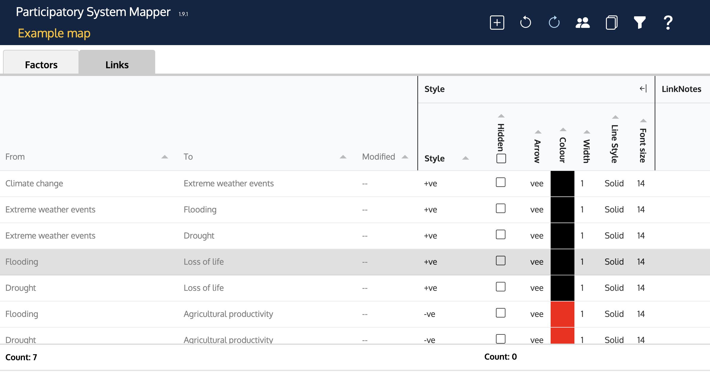
Above the table, there are tabs labelled 'Factors' and 'Links'. Clicking the Links tab displays a similar table but with one row for each Link:
Managing the whole table
At the top right is a row of buttons. These are:
-
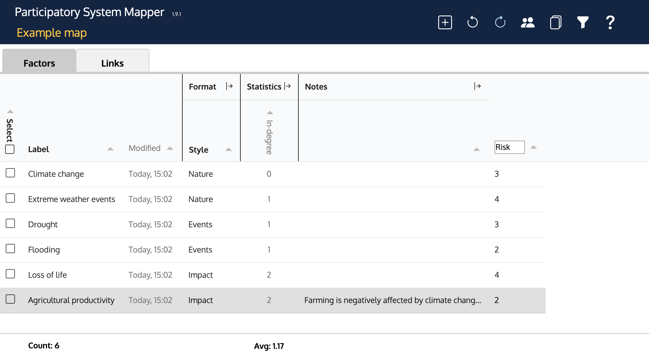
Add column Clicking on this button will add an extra column on the right of the Factcor table. This can be used to add any 'attribute' you wish to the factors. You can edit the heading to give the column an appropriate title, and then enter numbers or text into the cells. For example, you might use the extra column to record the importance of factors. Attributes can be used to cluster Factors.
Right click the column heading to see a menu to delete the column.
- Undo Restores the previous edit of a cell value.
- Redo Retracts a previous 'undo'.
- Share Allows you to copy the web link you need to open a Map view.
- Copy table Clicking on this button copies the whole table to the clipboard. You can then paste it into a spreadsheet such as Microsoft Excel for further analysis.
- Filter This enables you to filter rows according to some condition - for example, you might filter out all the rows that have labels that do not have the word 'climate' in them. Clicking on the button reveals a dialog just above the table:
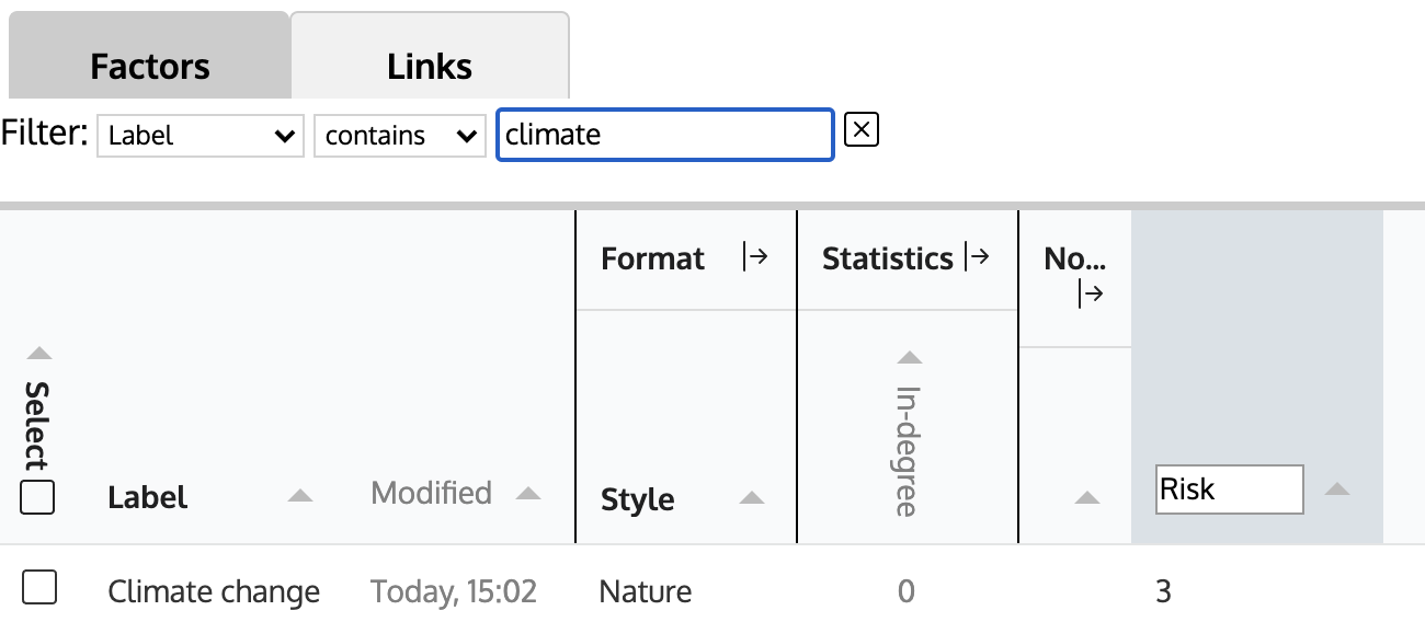
The first drop down menu includes all the columns (except those that are for colours; you cannot filter by colour). The second drop down menu has a set of conditions to apply to the values in the filter column. To the right of this is a text box where you can complete the condition. For example, to filter out all but those factors that have the word 'climate' in their label, you would use:
Label contains Climate
The rightmost ☒ is a button to dismiss the filter (or you can click the filter button again).
- Help brings you to this documentation.
Using the Filter and Select
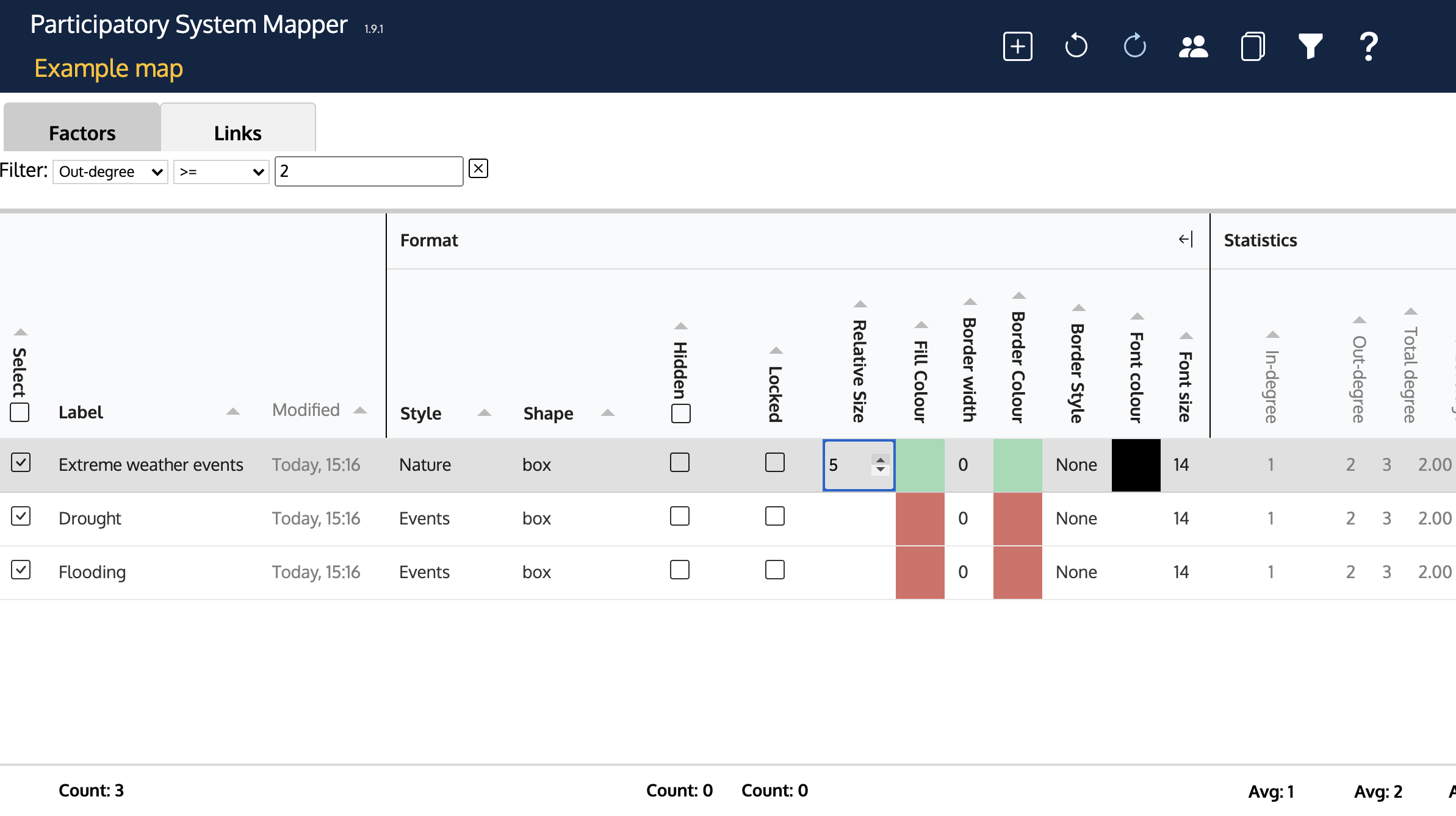
The Filter and the Select column can be used in combination. For example, suppose you wanted to display in a larger size all the factors that influenced 2 or more other factors, to emphasise them in the Map view. This is what you could do:
- Click on the Filter button. Set up a filter with Out-degree >= 2
- Click on the Select all check box at the top of the first column
- Click on one of the cells in the Relative Size column. Edit the value to ‘5’
- Look at the Map view. Observe that all the factors with 2 or more links pointing away from them are now larger than the rest.
Another, more complicated example: Show only those factors in the map with a value of betweenness centrality greater than some threshold, together with the links that go between these factors, and hide all other factors and links.
- In the Data view, sort the factors by Betweenness (click on the sorting triangle in the column header).
- Click the checkbox in the Hidden column header. This hides every factor in the map (if you glance at the map now, you’ll find that it is apparently empty)
- Open the Filter (click on the Filter button at the top), and filter using ‘Betweenness’ ‘>=’ ‘70’ (or whatever threshold value you choose).
- Uncheck the cells in the Hidden column in each of the rows that are now visible. This reveals the factors on the Map that have a Betweenness Centrality greater than the threshold, and the Links between them.